

As more and more people use the internet on their mobile devices, it is important for website owners to make sure their website is responsive. Responsive web design automatically adjusts the layout of a website to fit the device that is being used to view it. This ensures that all visitors have a positive experience when they visit your website, regardless of what type of device they are using.
While there are many benefits, some of the most important ones include increased traffic from mobile users, improved search engine rankings, and enhanced user experience. If you want your website to be successful in today’s market, then you need to make sure it is designed responsively.
Importance of Responsive Web Design
Responsive web design is becoming increasingly important in today’s technology-driven landscape due to its numerous benefits. This design technique allows websites to be optimized for all types of devices, providing better user experiences with improved accessibility and convenience. Integrating adaptive design also helps to increase mobile traffic, since more users are accessing the internet via their smartphones and tablets.
Additionally, the website’s search engine rankings can improve as well due to the design being more visible across devices. As a result, businesses should strive towards integrating responsive web designs that can provide customers with an efficient and convenient digital experience.

Benefits of Responsive Web Design
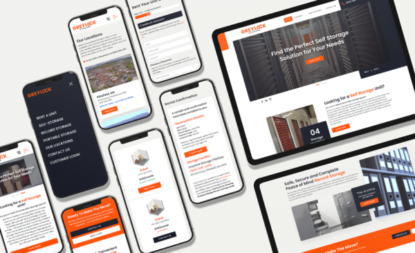
The most obvious benefit of responsive web design is that it allows your website to be accessible on any device, including smartphones, tablets, and desktop computers. This automatically increases the reach of your website, allowing more people to access the content they are looking for in a convenient manner.
Additionally, with responsive design, you can improve your search engine rankings as well since Google prefers websites with mobile-friendly designs. This means that if you have a website with a responsive layout, it will appear higher in search results compared to those without one.
Furthermore, many companies also appreciate the fact that responsive design requires only one version of the site instead of having separate versions for each device type.
Best Practices for Responsive Web Design
It is important to keep in mind a few best practices when designing your site. For example, it is vital to start with a mobile-first approach in order to make sure your content is optimized for smartphone users first. Additionally, employing flexible grids and layouts gives you more control over how the website appears on different screens.
To help facilitate this process, media queries can be used to identify various device and browser widths while image optimization techniques such as scaling display size down can improve loading times. According to an article by HubSpot, reducing mobile site speed by 0.1 seconds results in an 8% increase in conversions. Finally, user testing is an invaluable tool when gauging how successful a particular design implementation really is, helping developers make necessary changes or adjustments.
Challenges of Responsive Web Design
Responsive web design is an incredibly important asset for both customers and businesses, with the increased usage of smartphones and tablets. However, responsive web design poses a unique set of challenges due to device fragmentation and the engineering limitations of design. For starters, you have to take into account differing screen sizes that support different aspect ratios as well as swipe and touch capabilities.
As such, it is important to plan ahead by ensuring designs can scale up or down without sacrificing performance or visuals. Balancing performance, visuals, and design while overcoming tight design limitations posed by device fragmentation is no easy task when it comes to responsive web design. With careful planning, however, it is recommended to rely on a designer’s expertise to find creative solutions that take advantage of modern devices’ capabilities.
Examples of Successful Responsive Web Design
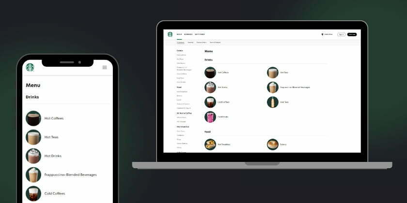
Taking a look at some of today’s most successful companies, one can see that having a well-designed and responsive website is essential for success. Airbnb, Starbucks, Apple, and Mashable are all leading examples of companies that recognize the value of having highly functional and strong responsive web design features. The websites for these businesses have unique designs that feature intuitive navigation systems and quick search functionalities which result in an overall better user experience.
Examples like these demonstrate why it’s so important to create web layouts that will work well on any device – desktop, tablet, or mobile. Responsive designs help to make sure customer engagement is high while also ensuring their journey through the website is a smooth one.
Conclusion
Responsive web design is essential to staying competitive in the modern world of web design. Not only does it create a much better user experience, but it is also a requirement for most platforms like Google who rate and prioritize their search engine rankings based on mobile-friendliness. Going forward, it will become even more important to consider every aspect of responsiveness when creating or updating a website or product. The return on investment (ROI) from implementing responsive strategies can be substantial from increased conversions to higher customer retention rates.
If you want to build your online presence, schedule a meeting today to learn how we can help you implement these strategies on your website!